Friday, October 30, 2009

Quilts: More Than Just a Blanket

The Nelson Art Gallery is currently holding an exhibition from September 24th till December 13th showcasing African American Quilts. The quilts are not only beautiful but also has a rich history embedded within every stitch and fabric. The different materials (such as: corduroy, velvet, satin, and taffeta) used within the quilts accent the rich and beautiful colors. The African American slaves had to use whatever materials they could find to create a new usable quilt. Every little piece seems to tell a different story.

One of the pieces called “Piano Keys” by Avis Collins Robinson plays on the name that the strips of fabric looks like actually piano keys. But unlike the dull black and white piano keys, this quilt is rich in shades of blue, red, yellow, and orange. The repeated shapes all lined vertically creates a sense of unity within the piece even though it has a lot of crazy colors. This creates a sense of visual rhythm that brings the whole piece together. Some might even say that if you look hard enough, you might see hills, sky, and a sunset. It seems as though the creator took time out to compose the different colors in a meaningful and pleasing way, expressing their creativity within this everyday object.

Thursday, October 29, 2009

Fashion; Do We Really Need it?

As Halloween comes around, there are many colorful and playful costumes around. But it doesn't take a genius to see that there are people who are uncomfortable in their costume. This brings to mind how fashion hasn't always been reasonable.

Some people see fashion as a statement, an indicator of social status, a tool. There are practical uses for protective clothing (firemen's suits, bee masks, etc.), but there are also many unnecessary qualities that people embrace. It's not sure when fashion really came about, but there are clues that they have been around for thousands of years. There have been drawings, paintings, and even a few article of clothing that has been preserved throughout history that shows us the importance of fashion.


http://www.historic-uk.com/HistoryUK/England-History/QueenElizabethCoronation.jpg
Royalty would use it as a symbol of wealth. They would adorn unnecessary ornaments and cumbersome clothing just to say, "I'm wealthy enough to wear this." Sometimes it gets so extravagant, the wearer can't even move around in their respected "fashionable clothes". But this does not matter because it shows that wealthy people don't need to do mundane daily chores and can be waited on day and night by servants.


http://badcontrol.com/wp-content/uploads/2008/06/foot-binding-6.jpg

An extreme example of painful fashion would be feet binding in China. It was said that the smaller the foot was, the more exotic and beautiful the women becomes. Girls often start wrapping their feet at an early age, breaking the arches of their foot, and stuffing them into small decorative shoes. Parents would subject little girls, sometimes even toddlers, to this painful practice in order to be accepted into society and attract a husband.

Is it really worth it to subject oneself to pain and discomfort, just to show up the next person?

Sunday, October 25, 2009

Grids Grids Everywhere

Most of us don't really bother to spend a few more minutes to scrutinize the designs that are all around us. Take web page building for example, how many of us actually sit down and look at the web page and say, "Oh! I see the grid structure behind all this elaborate artwork!" In our society, most people take for granted the simplest things like the grid structure. The grid structure gives us a sense of balance and order.


http://www.codinghorror.com/blog/images/css-grid-layout-samples.png
Here is an illustration of many different layouts that can be used as an under structure to website building. It organizes information for friendly usability (how easy it is to navigate around the webpage), and the most efficient way of conveying information.

If you take a closer look, even this blog is evenly structured with a grid for asethetics and to allow the users to go through the web page quickly without having to search around and waste time for the information they need.

In this fast-paced world that we live in today, we tend to take for granted things that make our life more efficient and pleasing.

Saturday, October 24, 2009

2D vs 3D

Even though 2D designs are things on a flat medium, there are many ways to achieve a more dynamic composition and dimension without ever having to stray off your canvas.


http://www.headstandmedia.com/wp-content/uploads/2007/11/citibank-center.jpg

Here in this illustration of a building, the artist manipulates scale and perspective in order to achieve a realistic look. The things that are supposedly closer to the viewer is larger in scale and more detailed than the things in the back. This is one way to achieve a 3Dimensional feel on a 2Dimensional medium. There is also an emphasis of a focal point. The road tends to lead the eye towards the building, which is the main subject of this illustration.

http://www.asu.edu/cfa/wwwcourses/art/SOACore/scale_interact/floorplan.gif

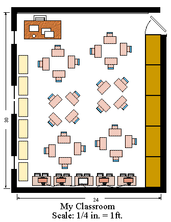
In the floor plan above, there is no juxtaposition of scaling to make the illustration seem more realistic. The objects are scaled to a proportion of the real size and everything lays flat on the page.


http://techhouse.brown.edu/~mjm/sandiego/l3.JPG
This is a scaled model of the Sydney Opera House. The model is scaled according to the proportions of the real Opera House. Through the manipulation of size and scale, the artist is able to fit all the details of the original opera house into a smaller model. This creates a sense of realism for the viewer, and may even create an illusion of looking at the real Opera House from a distance.

Some 2 Dimensional and 3 Dimensional art (like the examples above) utilizes scale and proportion to create a sense of realism and depth. Though the medium is different, the techniques used creates an illusion for the viewer, allowing their minds to imagine depth to the structure.

EMPHASIZE!

In our world today, there are a lot of advertisements and things trying to gain our attention. Whether if you're trying to sell your paintings or if you're trying to sell a product, there are many ways to attract people.


http://digital-photography-school.com/wp-content/focal-point.jpg
Sometimes, it is more pleasing to have fewer focal points for the viewer to focus on so they can appreciate the beauty and simplicity of an everyday object. Take the flower above for example: The photographer blurs the rest of the flower but leaves the intricate center sharp and vivid, allowing the viewer's eyes to flow easily towards the subject. This contrasting method does not necessarily have to be done through aperture settings or blurring an artwork, it can also be done with colors, elements of shapes, and tone.


http://www.laurentbrouat.com/wp-content/uploads/2009/09/Isolation.jpg

Another way to bring attention to your subject is through isolation. In this picture, the man is the only thing surrounded by plain monotone walls. This not only draws all your attention towards the man, but it also gives emphasis on the man's body language and emotion. The man is isolated and in despair.

Tuesday, October 13, 2009

Finding Inspirations

Some people expect to be able to come up with great ideas just looking at a piece of blank paper, but for all they know, they were influenced by the medium that they're using (the type of paper, a pen/pencil, etc). A person can draw different types of lines whit a mechanical pencil as opposed to a regular yellow #2 pencil.

Everyone has times when they are in a writer's block, drawing a blank, or simply cannot come up with ideas for their designs or artwork. A way to remedy this brain fart can be to look outside the box for inspirations and ideas. Step back and take a look around and try to see the details of the world. There are artists that uses organic materials from nature to make a beautiful expression, architects bend and shape metals to create interesting shapes and houses, designers that use recycled materials for everyday objects.

When working on a project, it is important to do sufficient research to see what is being represented and in what ways it can be done. But most importantly, don't forget to take inspiration outside yourself and make it your own. People can be inspired from many different things. A person can combine great ideas outside themselves into a composition totally of their own.

Monday, October 12, 2009

The Creative Process; A Neverending Cycle

Thinking -> Looking -> Doing -> Criticism -> Doing -> Refining -> Doing

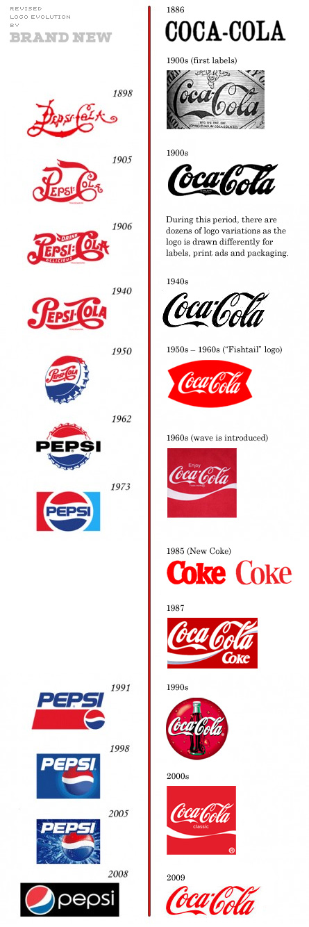
Some people say a designer's work is never done. The creative process can be anywhere from long to short, fruitful to unsuccessful. No matter what you do to a design, it can always be changed or refined. Take a look at this image of Pepsi-Cola's logos and Coca-Cola's logos taken from this blog post about their ever changing design:
http://www.underconsideration.com/brandnew/archives/coca-cola_vs_pepsi_revised_edition.php#comments


After more than a century of product placement, their logo changes or gets tweaked. No matter how much work you've put into it, there can always be improvements or change.

1. You start out with creating an idea.
2. Look around for ideas and inspirations.
3. Make your design.
4. Have critiques and analyze.
5. Refine.
6. Critique and analyze.
7. Refine.

But where do we stop? The creator has to decide when they are satisfied enough let the design go into production or when to stop refinement. It is important to not limit yourself, but still necessary to set goals and boundaries.